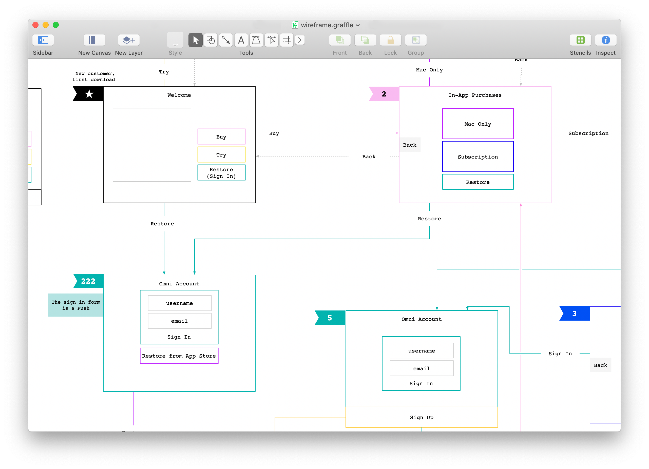
You’ve got an idea—you did the hard work of coming up with an app, website, or brand-new product. Now it’s time to figure out how to share it. Wireframes and prototypes are tools that are relatively easy to create and can help you visualize the functions and possibilities for your concept. Here, we’ll explain what wireframes and prototypes are, the uses for both, and how they differentiate—so you can determine which is best for your project and build a plan to share your idea with the world.
What is a wireframe?
A wireframe is a static, basic sketch of your website, which makes it the perfect visual starting point during the brainstorming process. Rectangles or squares are used as placeholders to show the location of potential graphics, buttons, or text, and the accompanying lines connecting these shapes indicate the order of information shared on each page.
There are two different types of wireframes: low-fidelity (lo-fi) and high-fidelity (hi-fi). A lo-fi wireframe will help you map out the basic schematics of your site in black and white. In contrast, a hi-fi wireframe is typically constructed after a lo-fi wireframe and presented in grayscale—this simulates actual color tones to help you better visualize the final version. Think of the hi-fi wireframe as a more detailed blueprint of your concept that will give viewers a better understanding of the look, feel, and functionality of your site. Hi-fi wireframes often contain no content or some placeholder content, such as lorem ipsum, typeface preferences, and specific dimensions for images.
Both types of wireframes are useful during the creative process and can be produced using design tools like OmniGraffle. If you’re starting from scratch, sketch a lo-fi wireframe to establish the basic layout of your site and hone in on the essential hierography of information. Then, create a hi-fi wireframe to explore more of the UI and UX details. Keep in mind that simplicity is key when creating a wireframe—don’t worry about aesthetics. Your goal is to quickly communicate your idea by constructing a simplified visual representation of your design.

What is a prototype?
A prototype is an interactive model or simulation that demonstrates how the finished website or app will work. The primary goal of a prototype is to test the design and functionality of your concept before moving on to the next phase of development. Creating a prototype might seem like a waste of time, but it’s a crucial step in discovering potential flaws and can save you time and money in the long run.
Like wireframes, prototypes also differ in complexity—lo-fi or hi-fi—based on the level of interactivity that’s possible (e.g., how many buttons can be clicked), visual design, and content. Lo-fi prototypes are often paper sketches with some basic visual attributes (rectangles, boxes, and buttons) representing the order of information, and the interactivity is simulated by a person. More realistic in appearance and with a higher degree of functionality, hi-fi prototypes are computer-generated simulations that look and feel like the final product—all interface elements (animations, graphics, colors, and content) are included with interactive clickable hotspots for users to experience the site.
Creating a prototype allows you to test and tweak the functionality of your design and discover any features you may want to add to your product before entering the final phase of design. Prototypes take more time to construct than wireframes, but the feedback gained through user interaction can be invaluable. The more realistic your prototype is, the more in-depth feedback you’ll gain for future iterations.

Understanding the difference between a wireframe and a prototype will help you determine which one best suits your needs. Using these design tools to map out and communicate the usability and functionality of your concept—and test your product—will save you time and resources and take you one step closer to production.

